Visualization
canopy includes high-level functions to make figures directly from a Field object using Seaborn and Cartopy libraries.
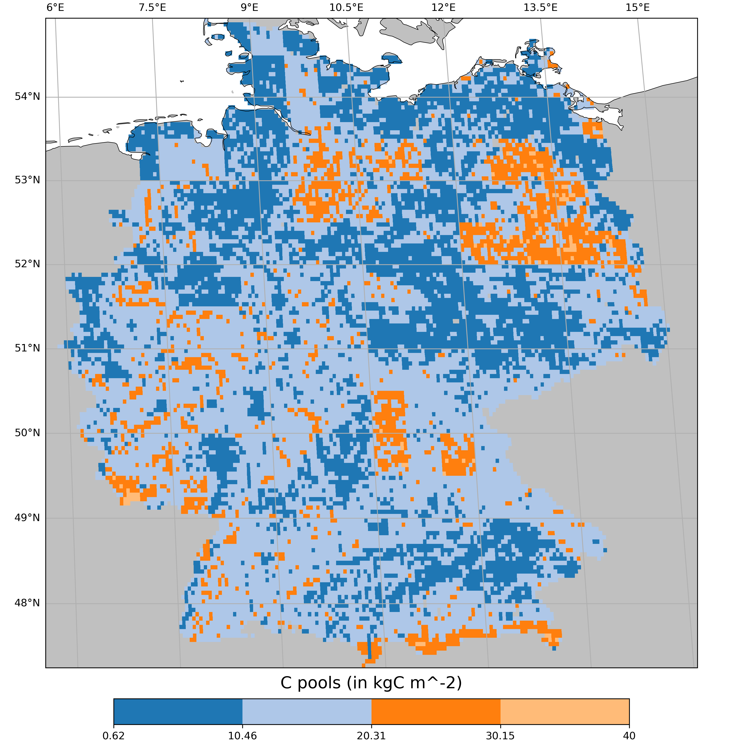
Make a map
Using a Field object, you can make a simple map with make_simple_map():
# Load your Field object first
run_ssp1 = cp.get_source("example_data/ssp1A/","lpjguess")
run_ssp1.load_field("cpool")

cp.visualization.make_simple_map(field=run_ssp1.cpool, layer="Total")
You can check the different arguments available in the API reference: make_simple_map().
Note
make_simple_map is using a Field to produce a figure.
By doing so, the rasterisation with Raster is included in the function.
Warning
In certain configurations, the use of “EuroPP” as projection will introduce a bug that will produce undesired polygons on the ocean.
This originates from Cartopy and is being discussed in their github issues.
If you encounter such issues, please use “TransverseMercator”, an adapted projection for the Europe region.
cp.visualization.make_simple_map(field=myfield, layer="Total", projection="TransverseMercator")
You can also make a difference map between two Field objects using make_diff_map():
cp.visualization.make_diff_map(field_a=run_ssp1.cpool, field_b=run_ssp3.cpool, layer="Total")
Every time you call make_diff_map() or make_simple_map() with a output_file, a histogram of your data is produced in a separated file.
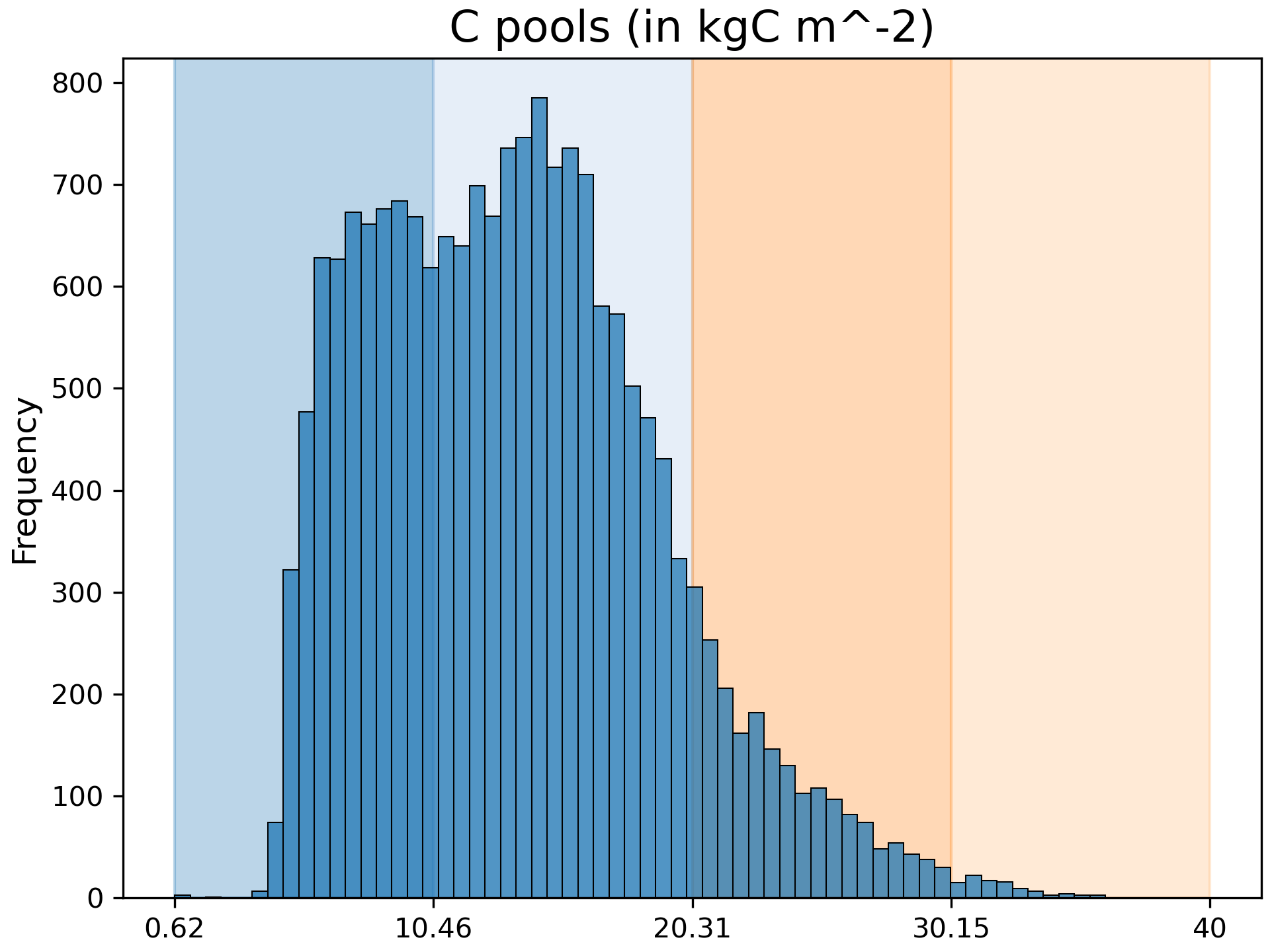
This graph helps you see the distribution of the values and the colour classification (on the background) applied to it.
Explore different data classification methods with the argument classification, more information can be found on this tutorial.
Make a time-series
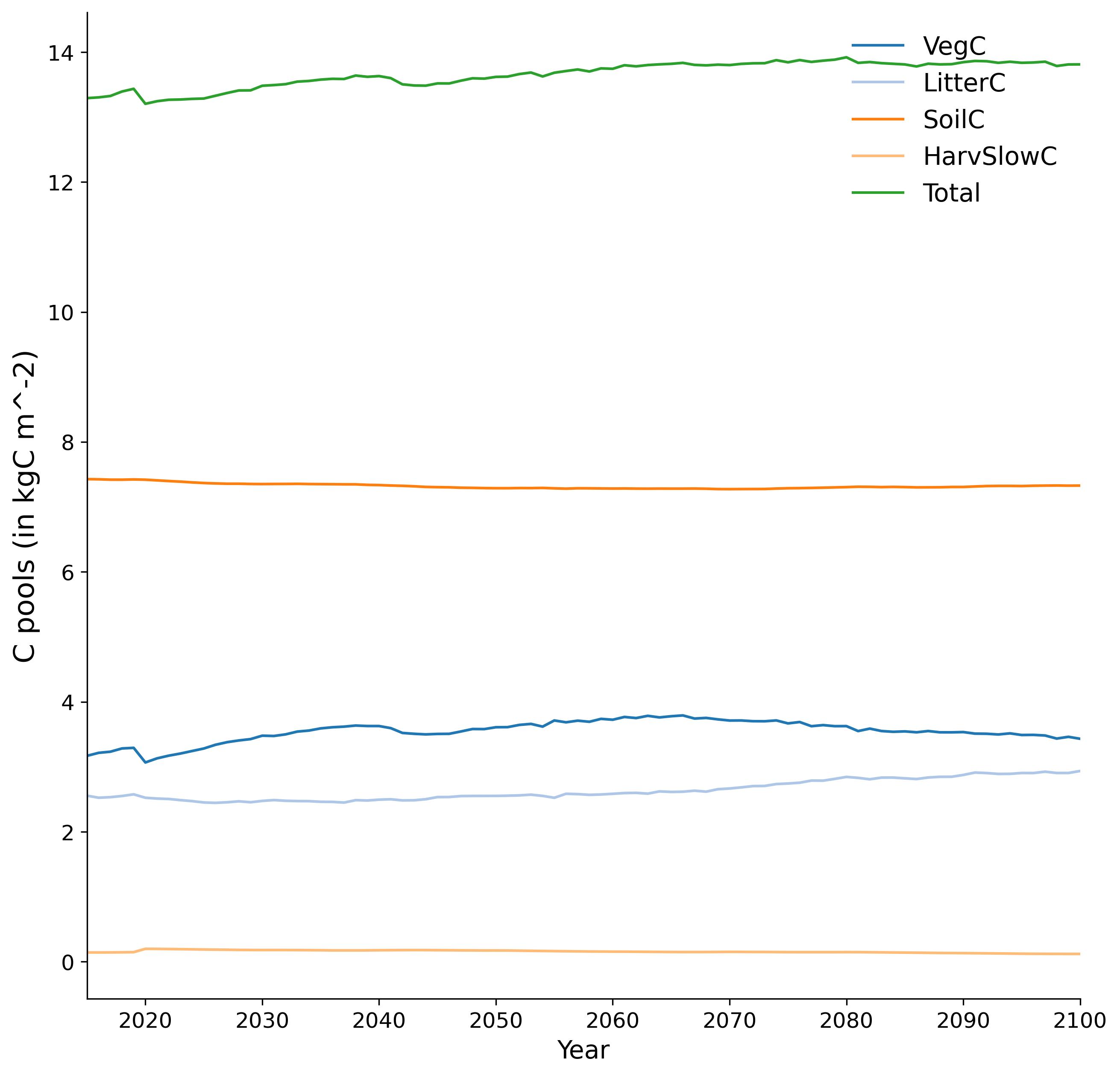
Using a Field object, you can make a time-series with make_time_series():
cp.visualization.make_time_series(fields=run_ssp1.cpool, gridop="av")
You can check the different arguments available in the API reference: make_time_series().
Note
make_time_series is using a Field to produce a figure. By doing so, the linearization with make_lines is included in the function.
The gridop argument can be used to perform a spatial reduction (e.g. 'av' for averaging, 'sum' for summing).
You can also make a difference map between two Field objects using make_diff=True.
In addition, you can use kwargs arguments from the seaborn.lineplot and matplotlib.lines.Line2D functions. This allows customization of line aesthetics such as linewidth, linestyle, alpha, etc.
cp.visualization.make_time_series(fields=run_ssp1.cpool, gridop="av", layers="Total", linewidth=3, linestyle='-', alpha=0.3)
Warning
Kwargs arguments are not available if rolling_mean=True.
If you want to compare multiple time-series on the same figure, the function argument fields also accepts a list of Field objects:
import canopy.visualization as cv

# Let's load first multiple Field objects
run_hist = cp.get_source("example_data/hist/","lpjguess")
run_ssp1 = cp.get_source("example_data/ssp1A/","lpjguess")
run_ssp3 = cp.get_source("example_data/ssp3A/","lpjguess")
run_hist.load_field("cpool")
run_ssp1.load_field("cpool")
run_ssp3.load_field("cpool")

# Make a list of your loaded Field objects
fields = [run_hist.cpool,run_ssp1.cpool,run_ssp3.cpool]

cv.make_time_series(fields=fields,
                    gridop="av",
                    layers=["Total","VegC","SoilC"],
                    field_labels=["hist","ssp1","ssp3"])
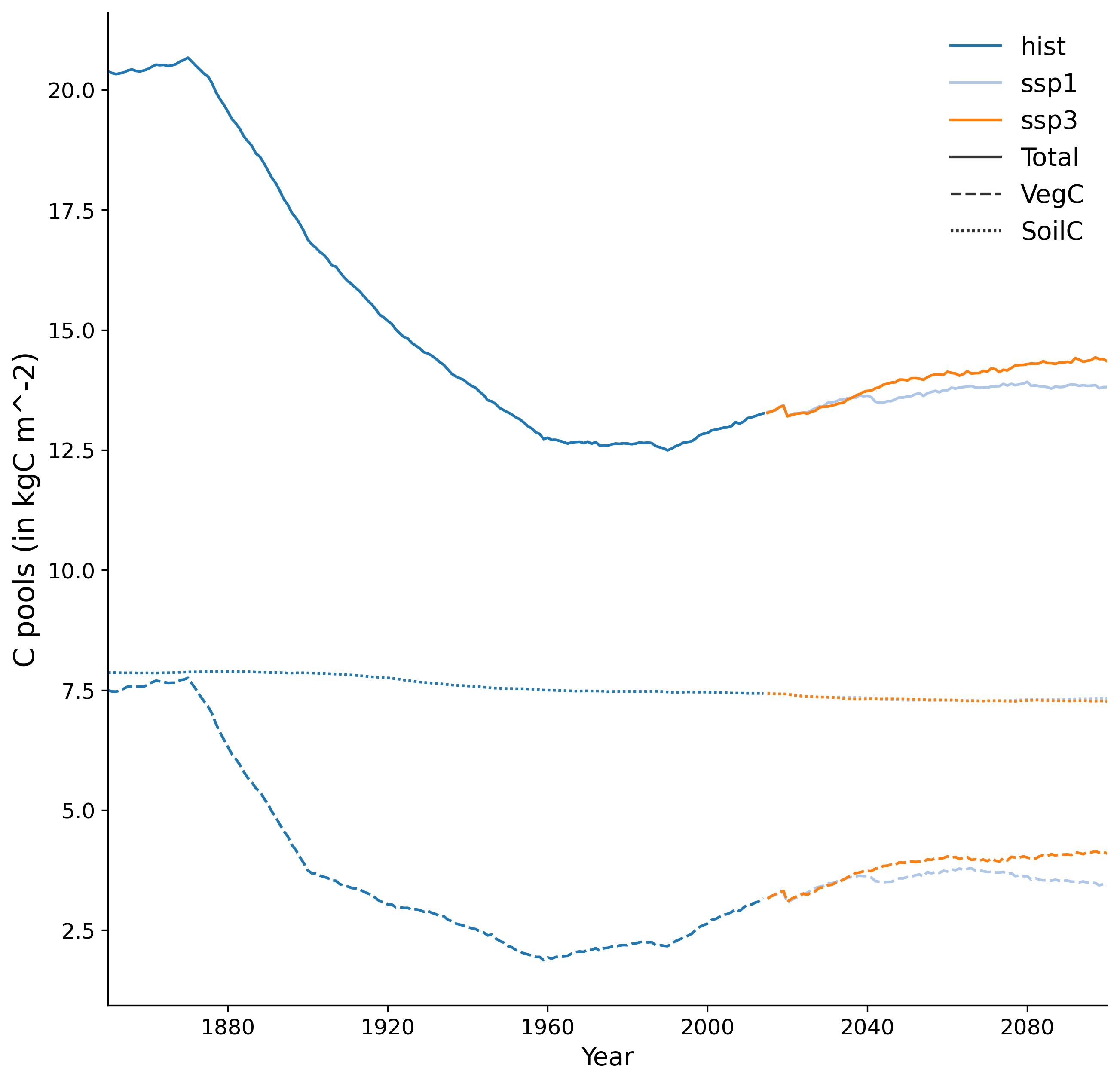
In this case, the function argument field_labels, the list of labels for the time series, is mandatory.
By default, each time-series will get a different colour, and each layer will get a different line styles (solid, dashed, etc.).
If you want to invert this behavior, you can use the function argument reverse_hue_style:
cv.make_time_series(fields=fields,
                    gridop="av",
                    layers=["Total","VegC","SoilC"],
                    field_labels=["hist","ssp1","ssp3"],
                    reverse_hue_style=True
                   )
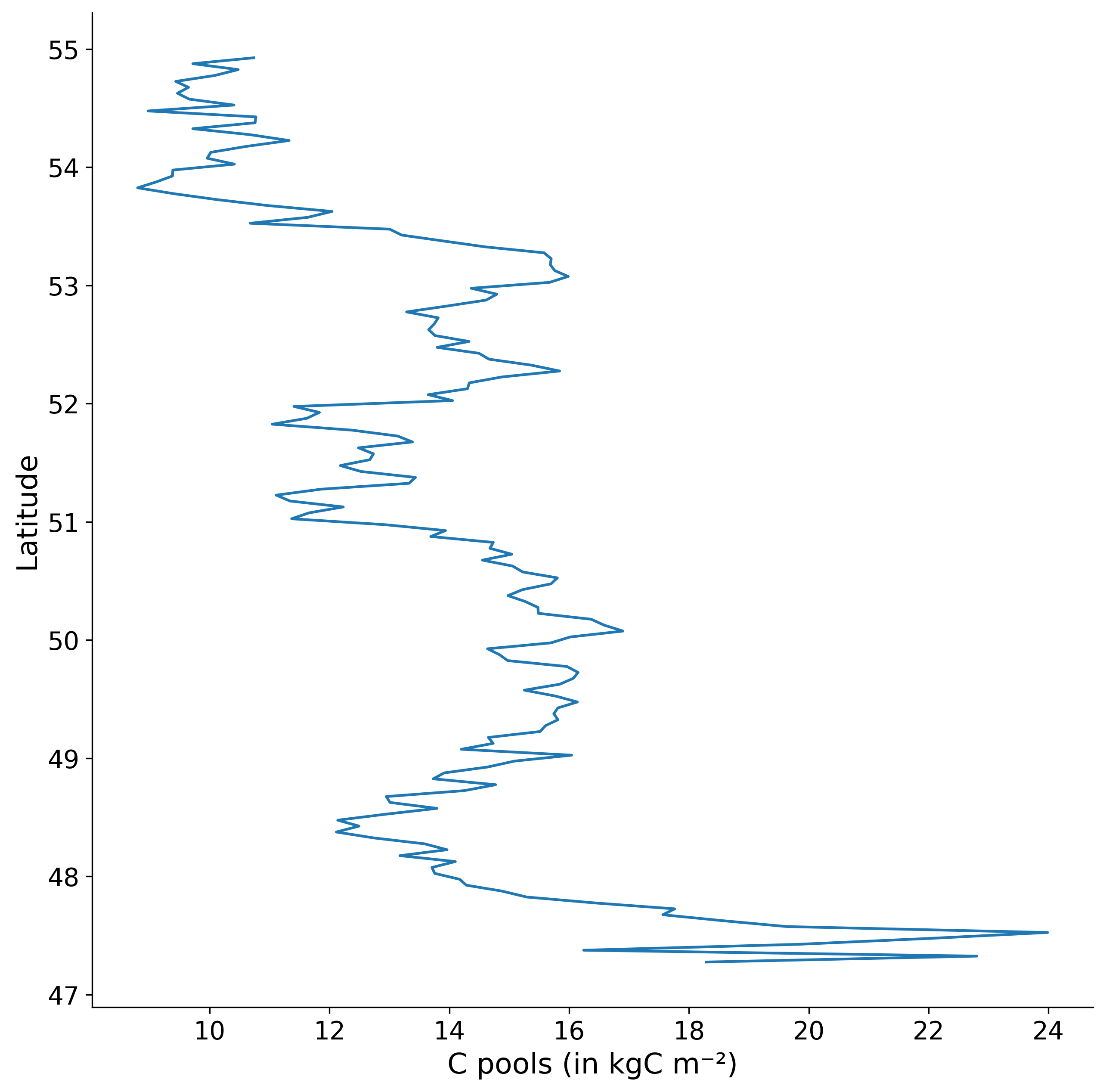
Make a latitudinal plot
You can create a latitudinal plot showing variable values as a function of latitude using make_latitudinal_plot(). The plot displays mean values averaged over time at each latitude, with the x-axis representing the variable value and the y-axis representing latitude:
cv.make_latitudinal_plot(fields=run_ssp1.cpool, layers="Total")
You can check the different arguments available in the API reference: make_latitudinal_plot().
Note
make_latitudinal_plot is using a Field to produce a figure.
By doing so, the spatial reduction along longitude and time averaging are included in the function.
In addition, you can use kwargs arguments from the seaborn.lineplot function. This allows customization of line aesthetics such as linewidth, linestyle, alpha, etc.
cv.make_latitudinal_plot(fields=run_ssp1.cpool, layers="Total", linewidth=3, linestyle='--', alpha=0.7)
If you want to compare multiple fields or layers on the same figure, the function argument fields also accepts a list of Field objects:
# Let's load first multiple Field objects
run_hist = cp.get_source("example_data/hist/","lpjguess")
run_ssp1 = cp.get_source("example_data/ssp1A/","lpjguess")
run_ssp3 = cp.get_source("example_data/ssp3A/","lpjguess")
run_hist.load_field("cpool")
run_ssp1.load_field("cpool")
run_ssp3.load_field("cpool")

# Make a list of your loaded Field objects
fields = [run_hist.cpool,run_ssp1.cpool,run_ssp3.cpool]

cv.make_latitudinal_plot(fields=fields,
                        layers=["Total","VegC","SoilC"],
                        field_labels=["hist","ssp1","ssp3"])
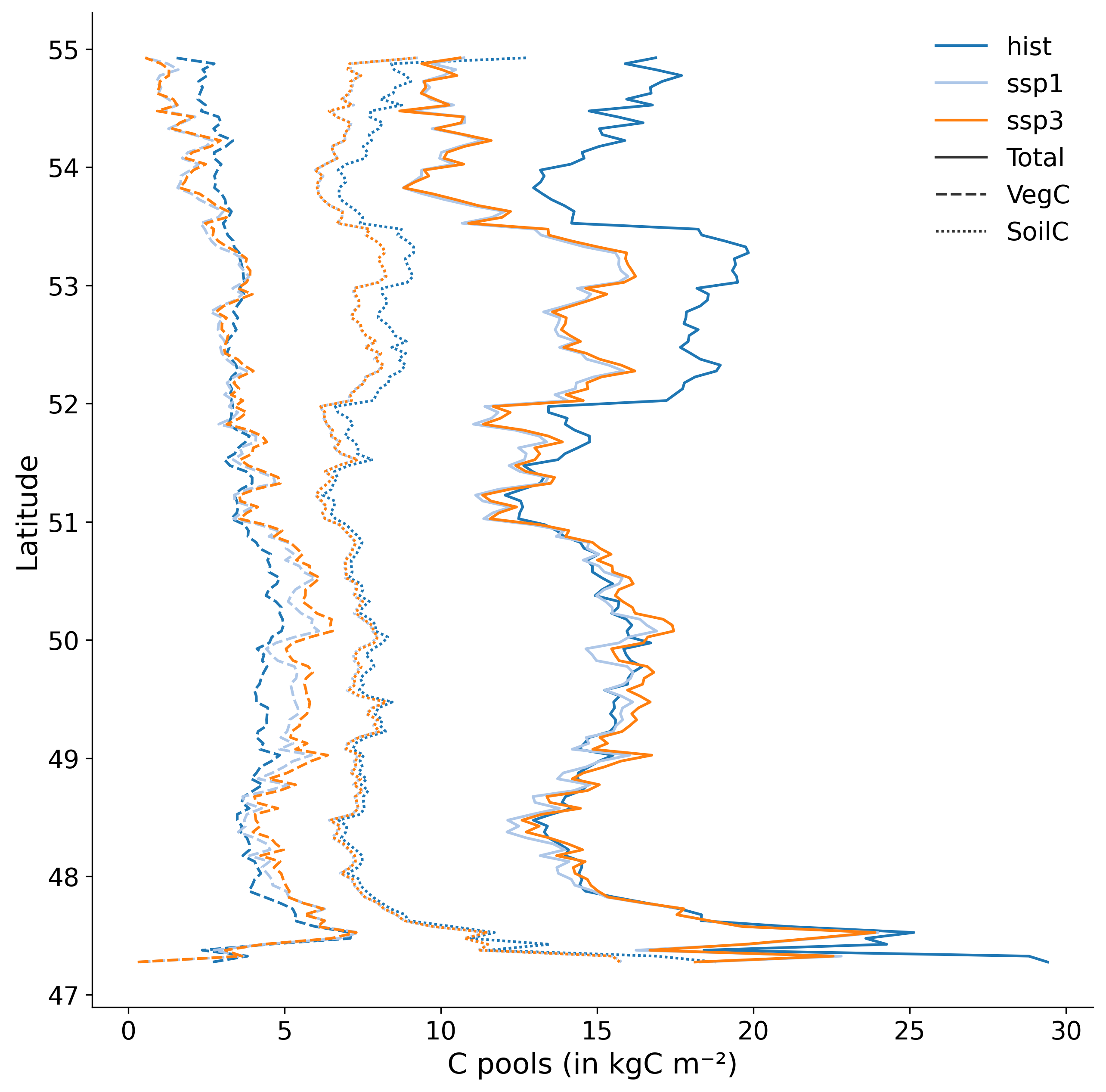
In this case, the function argument field_labels, the list of labels for the fields, is mandatory when multiple fields are provided.
By default, each field will get a different colour, and each layer will get a different line style (solid, dashed, etc.).
Make a static plot
You can produce a scatter plot with regression lines and r-scores to compare two Field objects (which can be reduced spatially, temporally, or both beforehand) with make_static_plot():
cp.visualization.make_static_plot(field_a=run_a, field_b=run_b,
                                  layers=["Abi_alb","Bet_pen","Bet_pub","Que_rob","C3_gr"],
                                  field_a_label="With land-use",
                                  field_b_label="Without land-use",
                                  unit_a="kgC/m²",
                                  unit_b="kgC/m²",
                                  title="Actual GPP over Europe",
                                  palette="tab10",
                                  move_legend=True,
                                  dark_mode=True,
                                  x_fig=10,
                                  y_fig=10
                                 )
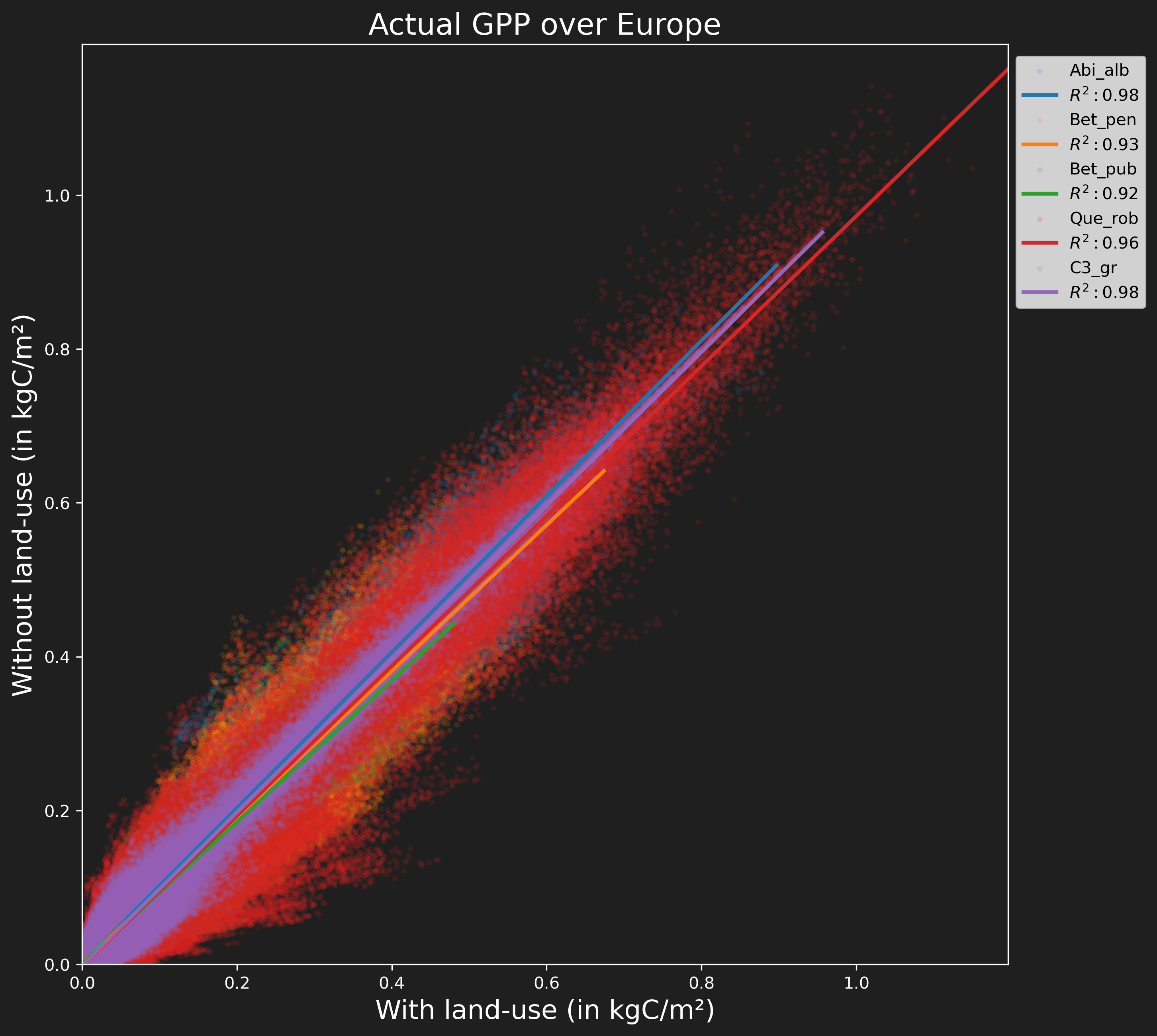
You can check the different arguments available in the API reference: make_static_plot().
In addition, you can use kwargs arguments from the seaborn.regplot function.
These two fields can be, for example, the same variable from two different runs, or two different variables from the same run.
Make a distribution plot
You can compare a list of Field objects (for example, different runs) with make_distribution_plot():
cp.visualization.make_distribution_plot(fields=[model_a, model_b],
                                        gridop="av",
                                        plot_type="box",
                                        layers="Total"
                                        layers=["Abi_alb","Bet_pen","Bet_pub","Que_rob","C3_gr"],
                                        field_labels=["Unmodified", "Modified"],
                                        yaxis_label="NPP",
                                        unit="kgC/m²",
                                        title="plot_type = 'box'",
                                        palette="tab10",
                                        x_fig=10,
                                        y_fig=7
                                       )
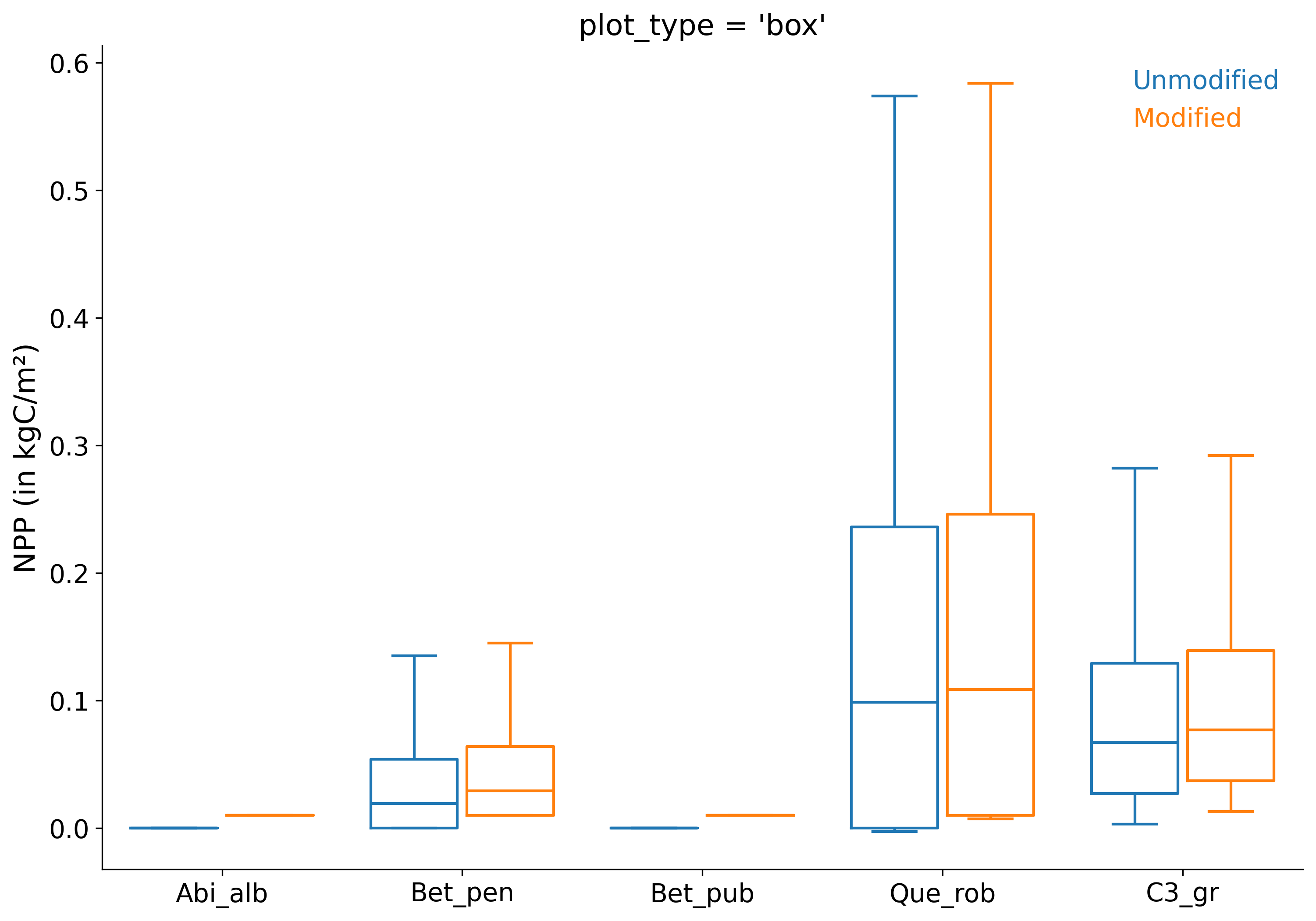
You can check the different arguments available in the API reference: make_distribution_plot().
This function can generate boxplot (“box”), strip plot, swarm plot, violin plot, boxen plot, point plot, bar plot, histogram plot (“hist”), KDE plot (“kde”), or ECDF plot (“ecdf”) based on the plot_type argument.
In addition, you can use kwargs arguments from the seaborn.catplot function (for categorical plots) or seaborn.displot function (for distribution plots).
Note
make_distribution_plot accepts any form of reduced Field objects.
You can reduce spatially, temporally, or both your Field objects beforehand.
Make a Taylor diagram
You can create a Taylor diagram to evaluate the performance of model data against observations using make_taylor_diagram(). A Taylor diagram is a specialized polar plot that visually summarizes how well different models reproduce observed data by displaying their correlation coefficient, normalized standard deviation, and root-mean-square error (RMSE) in a single plot.
import canopy as cp
import canopy.visualization as cv

# Import FLUXNET data (observations)
fnet_data = cp.get_source('fluxnet/selection', 'fluxnet2015')
# Import LPJ-GUESS run (model)
lpjg_data = cp.get_source('lpjg_output', 'lpjguess', grid_type='sites')

# Load fields
mlath_fnet = fnet_data.load_field('LE_MM')
maet_lpjg = lpjg_data.load_field('maet')

# Processing FLUXNET and LPJ-GUESS data to create filtered fields
# (see fluxnet_demo.ipynb for detailed processing steps)

# Create Taylor diagram
cv.make_taylor_diagram(fields=maet_lpjg_filtered,
                       obs=maet_fnet_filtered,
                       x_fig=7, y_fig=7
                      )
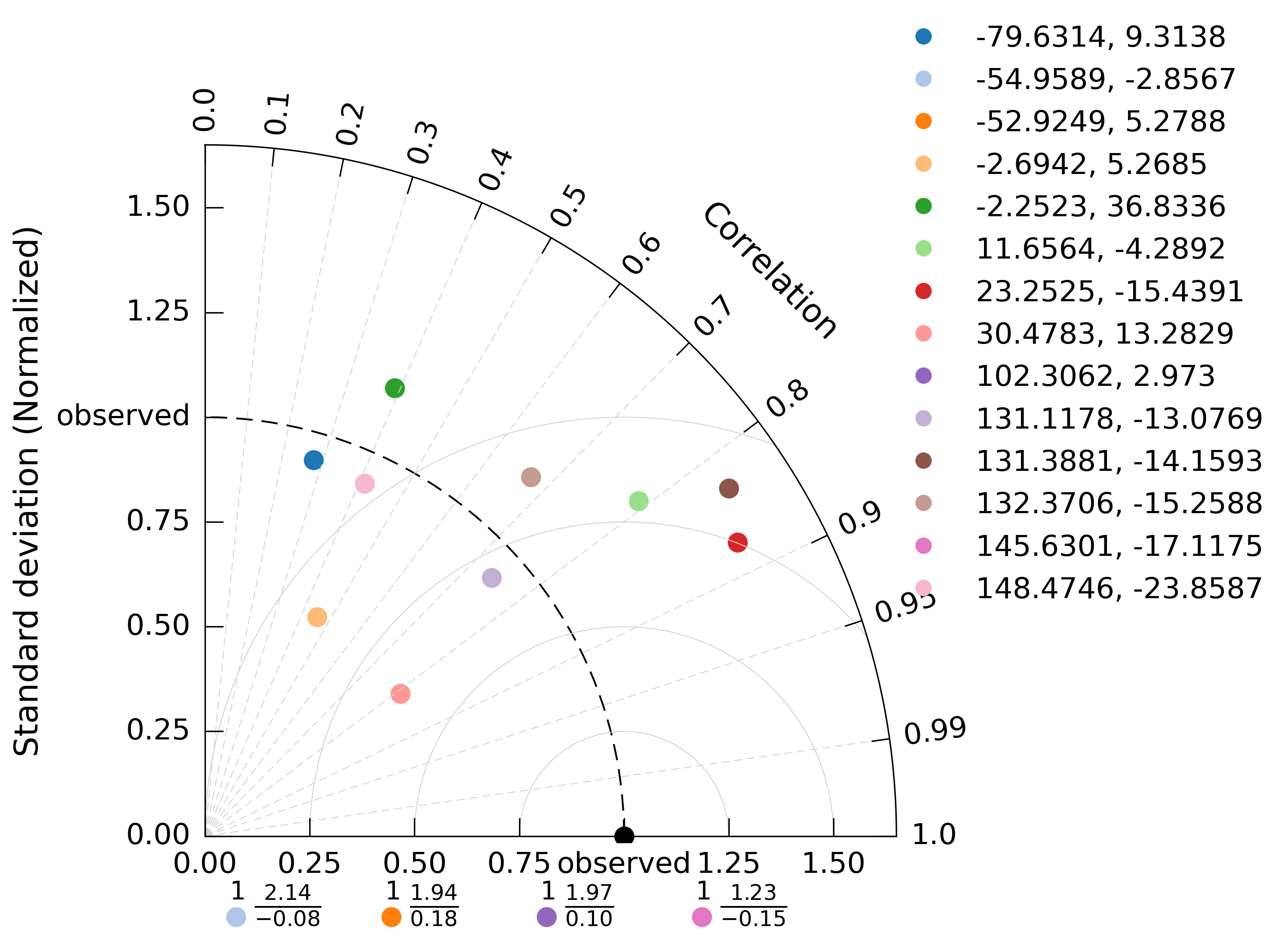
You can check the different arguments available in the API reference: make_taylor_diagram().
Note
make_taylor_diagram requires an observations field to compare against model data. Currently, only FLUXNET data is usable as observations. For detailed information on how to use and process FLUXNET data, refer to the FLUXNET demo notebook.
You can also compare multiple model fields against observations by providing a list of fields:
cv.make_taylor_diagram(fields=[model_a, model_b, model_c],
                       obs=observations,
                       field_labels=["Model A", "Model B", "Model C"]
                      )
In addition, you can use kwargs arguments from geocat.viz.TaylorDiagram.add_model_set to customize plot features such as annotate_on, model_outlier_on, etc.
Save figure and multiple plots in one figure
So far, the examples provided generate figures using Matplotlib’s interactive mode. However, if you are using canopy in a non-graphical environment (such as a terminal session) or wish to save your figures directly to files (e.g., as .png images), you can use the output_file argument in any visualization functions:
cp.visualization.make_simple_map(field=run_ssp1.cpool, layer="Total", output_file="ssp1_cpool_map.png")
This will save the generated map to ssp1_cpool_map.png instead of displaying it interactively.
Similar to R’s ggarrange, you can combine several figures into a single image using multiple_figs():
import canopy as cp
import canopy.visualization as cv

agpp = cp.Field.from_file("example_data/david/agpp.out")
agpp_nolc = cp.Field.from_file("example_data/david/agpp_nolc.out")

fig1 = cv.make_diff_map(field_a=agpp, field_b=agpp_nolc,
                        layer="Total",
                        return_fig=True
                       )

fig2 = cv.make_time_series(fields=[agpp,agpp_nolc],
                           gridop="av",
                           layers="Total",
                           field_labels=["with", "without"],
                           return_fig=True
                          )

fig3 = cv.make_distribution_plot(fields=[agpp,agpp_nolc],
                                 layers="Total",
                                 field_labels=["with", "without"],
                                 return_fig=True
                                )

fig4 = cv.make_static_plot(field_a=agpp, field_b=agpp_nolc,
                           layers="Total",
                           return_fig=True
                          )

cv.multiple_figs([fig1, fig2, fig3, fig4],
                 ncols=2,
                 output_file="combined_figures.png"
                )
This will arrange the four plots into a 2-column layout and save the combined image as combined_figures.png. Make sure to generate each figure with return_fig=True so that the figure objects are returned instead of being displayed.
Warning
multiple_figs re-runs each plotting function when it builds the combined figure, so each Field is used in its current state—not frozen when you created the return_fig=True wrapper.
If you reuse one Field and change it in place between plots (for example with reduce_layers(..., inplace=True)), an earlier subplot may be drawn again with a Field already altered for a later plot.
Workaround: do not use inplace=True on a shared field, or give each plot its own Field (let reduce_layers return a new Field, or assign each reduction to a separate variable).
Warning
The multiple_figs function manipulates image files, not the original figure objects, due to Cartopy limitations. As a result, some features—such as sharing a common legend across plots—are not supported in combined images.